Case Study

Pepper Money
Website Redesign

A full brand, UX, performance and accessibility overhaul of a specialist UK mortgage lender’s digital presence — from research and wireframes through to delivery.

Client
Pepper Money UK
Sector
Financial Services
Scope
Research · Wireframes · Brand · UX · Performance · Search
Audience
Customers, Brokers & Search Engines
90%
Faster page load times through code streamlining
15→8
Reading age reduced — genuinely inclusive copy
New
Sitemap, navigation system & Algolia search built from scratch

01 — Research & Audit

Understanding the problem first

Before any design work began, I mapped the full user journey across every audience type — brokers, first-time buyers, remortgagers, and returning customers. This process exposed the structural problems in the existing site and informed every decision that followed.

Process: User journey mapping identified 13 steps, 2 decision points and multiple drop-off moments in the broker journey alone. This underpinned the sitemap restructure, navigation redesign, and page hierarchy decisions throughout the project.

Process — User Journey Map

UX Research User Journey Flowchart — Broker & Customer paths
User journey map

Annotations — what this informed

1
Four distinct user journeys mapped — Broker New User, Customer First-Time Buyer, Customer Remortgage, and Broker Returning User. Each required different entry points, content and CTAs — the existing site treated all users identically.
2
Decision points identified — The broker journey alone contained 2 critical decision points (Already Registered? / DIP Approved?) that the old site failed to support clearly, causing drop-off at registration and post-DIP stages.
3
13 steps from discovery to completion — Mapping revealed several steps were unnecessarily separated across different pages, adding friction. This directly informed the decision to embed the affordability calculator and criteria inline on product pages.
4
Navigation informed by journey logic — The new sitemap and condensed menu were built around these journeys, not internal Pepper department structures. Broker tools, customer tools and shared resources are now grouped by user intent.

The audit surfaced the following specific issues the redesign needed to address:

Brand

Inconsistent visual identity — No style system governing colour, type or layout across the site.

Imagery

Staged photography — Disconnected from the real customers Pepper Money serves.

Tone of Voice

Reading age of 15 — Condescending, jargon-heavy copy excluding the people who needed clarity most.

Performance

Slow loading — Oversized imagery, video backgrounds and excessive JavaScript on every page.

Accessibility

WCAG failures — Across colour contrast, font choices and conflicting H1–H4 heading hierarchy.

Navigation

Mega menu — Consumed the full desktop viewport. Mobile required excessive scrolling with no grouping.

Information Architecture

Key information difficult to find — No clear user journey for customers or brokers across an extensive page count.

Code / CMS

No global components — Repeated hardcoded elements across every page made updates slow and inconsistent.

02 — Information Architecture

Rebuilt from the ground up — new sitemap

The existing site had no logical structure tying its pages together. Content had grown organically without coherent IA, making navigation difficult for both users and search engines. I rebuilt the entire sitemap from scratch — categorising every page, grouping by user type, and establishing a clear hierarchy that drove the new navigation.

Process: Every existing page was audited and re-categorised into four top-level navigation areas: Broker, Customer, About Us, and Search. Each area was structured with logical sub-categories, ensuring no important content was more than two clicks from the homepage.

Process — Final Sitemap

Sitemap pepper.money Sitemap FINAL — Broker · Customer · About Us · Search
Pepper Money final sitemap

Annotations — what this shows

1
Four top-level navigation areas — Broker (red), Customer (green), About Us (purple), and Search (grey). Previously the navigation mixed audience types and content types indiscriminately across a single mega menu.
2
Broker section restructured — Mortgage Products, Calculators, Mortgage Criteria, Your Customers, General Charge Mortgages, and Resources clearly separated as distinct sub-sections with their own page hierarchy.
3
Customer section separated cleanly — Mortgages, Homeowner Loans, Existing Customers, Help & Support, and Green Agenda grouped by customer need rather than product type — a fundamental shift from the previous structure.
4
Intermediary and Mortgage portals mapped — Both customer-facing and broker-facing portal pages mapped as distinct sub-trees, ensuring portal entry points are correctly positioned within their respective audience journeys.
5
Foundation for Algolia search — This sitemap structure directly informed the Algolia search categorisation, allowing search results to be grouped by the same top-level areas: broker content, customer content, and general information.

03 — Homepage

Wireframe to final — homepage

With the sitemap confirmed, I moved into wireframing. The homepage wireframe established the structural logic — audience splits, content hierarchy, product discovery and social proof — before any visual decisions were made.

Wireframe

Wireframe Homepage — structural layout
Homepage wireframe

After — Live site

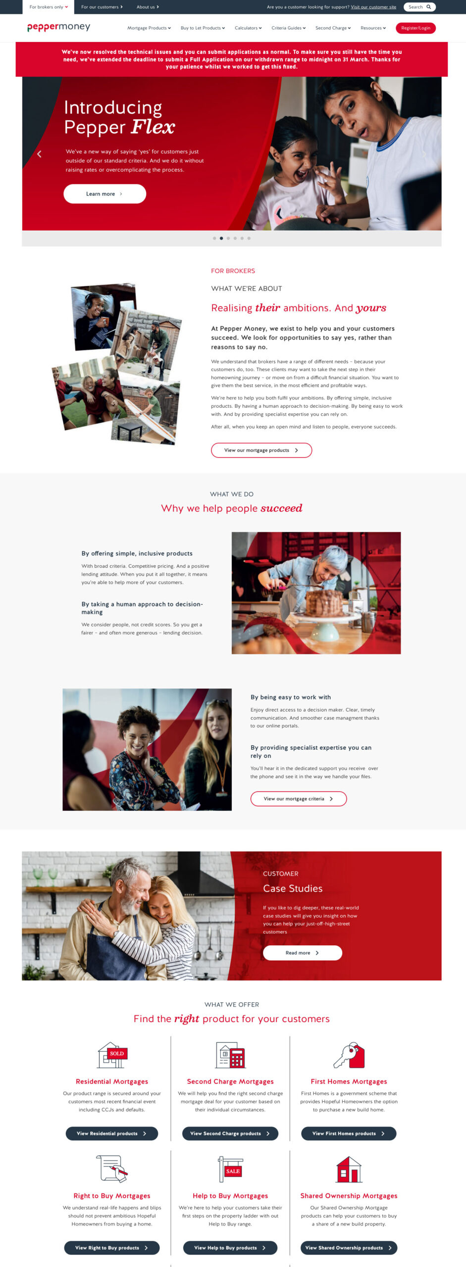
Wireframe to final — what was decided and why

1
Audience split in navigation — The wireframe established For Brokers / For Customers / About Us / Resources as the primary nav structure. This directly replaced the sprawling mega menu and was carried unchanged into the final build.
2
Hero: single message, two CTAs — Wireframe positioned a single headline with two audience-specific CTAs. Avoids the previous problem of the hero trying to speak to everyone at once with conflicting messages.
3
Dual product grids — brokers and customers separated — Two distinct product grids on the same homepage, one for each audience. Makes product discovery immediate without requiring a click into sub-navigation.
4
Trust signals placed deliberately — Trustpilot rating anchored near the page base as a considered conversion moment rather than decorative social proof. Retained unchanged in the final build.
5
Articles & Blogs module — Positioned after product sections — understand what Pepper does → find the right product → read to deepen knowledge. Carried into the final layout unchanged.
6
Global footer structure established — Wireframe defined the five-column footer (More Information, For Brokers, Products, Legal, Follow Us) that became the consistent footer template applied across every page.

04 — Broker Section

Wireframe to final — broker landing page

The broker landing page wireframe gave the broker audience a dedicated, structured entry point completely separate from the customer journey. The wireframe logic was carried forward and extended into the ‘Be more you’ campaign page.

Wireframe

Wireframe Broker landing page — structural layout
Broker landing page wireframe

After — Live site

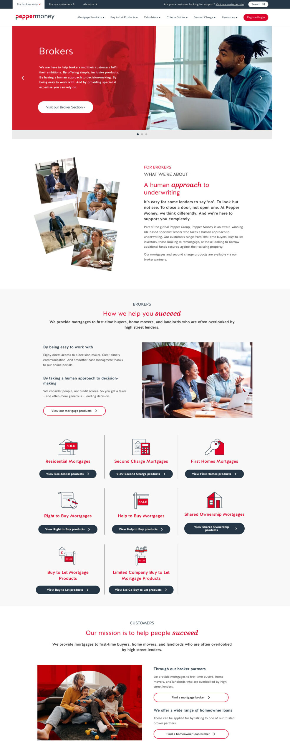
Broker wireframe to final — what was decided and why

1
Broker-only navigation variant — Wireframe established a trimmed navigation for broker pages without customer-facing links cluttering the experience. An audience-specific nav pattern introduced by the redesign.
2
‘What We’re About’ as a trust module — Three core broker propositions (Specialist Expertise, Fast Decisions, Dedicated Support) immediately after the hero. Became the ‘Be more productive / balanced / confident’ section in the final build.
3
Product grid by use case, not product type — ‘What We Do’ section organised by customer scenario (Self-Employed, Adverse Credit, Complex Income) rather than product name — a deliberate shift to broker-first thinking.
4
Live service levels as a conversion tool — Real-time service metrics (24hrs DIP, 5 days Full Offer, 98% Satisfaction, 4.7★) placed as a dedicated stats band. A direct response to broker feedback that speed and reliability are their primary concerns.
5
Resources surfaced at page level — Product Guides, Calculators, Criteria, Packaging, Downloads brought onto the landing page itself. Previously buried 3–4 clicks deep — moving them here reduced friction significantly.
6
Strong conversion footer CTA — Wireframe closed with a full-width ‘Ready to Partner With Us?’ CTA block. This became a globally injected shortcode component in the final build, consistent across all broker pages.

05 — Product Pages

Mortgage products — structure & scannability

The residential mortgage products page was among the most complex on the site — rates, criteria, calculators and broker tools all on one page. The challenge was clear visual hierarchy so brokers could scan quickly, while customers could understand without jargon.

After — Residential Mortgage Products


pepper.money/broker/mortgage-products/residential

Residential mortgage products

Annotations — what changed

1
Simplified page hero — Reduced from a full-bleed background image with overlay to a clean structured header with clear H1 and a single CTA. No competing visual noise.
2
Tabbed rate filter system — Products grouped by type with accessible filter controls. Previously all rates listed as undifferentiated rows, overwhelming brokers mid-research.
3
Consistent H-tag structure enforced — Product categories H2, individual products H3, criteria details H4. Eliminates conflicting heading hierarchy and improves screen reader and SEO performance.
4
Affordability calculator embedded inline — Previously a separate standalone page, now injected as a global component directly into the product flow. Removes a navigation step for brokers mid-research.
5
Criteria surfaced inline — Lending criteria visible directly on the product page rather than buried in a separate guide. Reduces navigational steps for a broker assessing case eligibility.

06 — Product Detail

Individual product pages

Each mortgage product now has a clean dedicated detail page — built from a reusable template with consistent components, clear criteria tables, and a global CTA block. New products can be published quickly without rebuilding each page from scratch.

After — Product Detail (Pepper48 Light)

pepper.money/broker/mortgage-products/r26945
Product detail page

Annotations — what changed

1
Consistent product header — Product name, type and CTA in a uniform banner. The Broker Login/Register CTA is globally injected — one change updates this across all product pages instantly.
2
Two-column criteria layout — Product Details and Credit Criteria side by side in clearly labelled tables. Brokers assess eligibility at a glance rather than hunting through paragraph copy.
3
Tick-list feature highlights — Key product features (Application fee, Incentives, Pepper Flex) as a visual checklist. Fast context on what makes each product different.
4
Global CTA block — ‘Need help with your mortgage case?’ is a globally managed shortcode component. Updated once, reflected across the entire product estate.
5
Simplified footer — Restructured into logical columns: More information, Follow Us, Also of Interest. Previously heavy and inconsistently applied across page templates.

07 — Interactive Tools

Homeowner loan calculator

The loan calculator was rebuilt as a clean, accessible interactive tool — stripped of background complexity, consistent typography, accessible colour ratios. Built as a global component, injectable into any relevant landing page via shortcode.

After — Homeowner Loan Calculator

pepper.money/homeowner-loans/calculator
Homeowner loan calculator

Annotations — what changed

1
Global navigation consistent throughout — The condensed nav bar is visible here exactly as on every other page. One navigation to maintain, applied everywhere via the theme system.
2
Clean section header — Red banner used purposefully as a page header with clear H1 and a single CTA. No background imagery, no opacity overlay — pure typographic clarity.
3
Accessible calculator UI — Slider inputs, clear field labels, and results with consistent type hierarchy. Colour used only to highlight key figures, never decoratively.
4
Trustpilot anchored in footer — Social proof consistently present via a global footer component. Previously inconsistently applied across page templates.
5
Accessible legal disclaimer text — Required regulatory copy in legible, appropriately sized type. Previously rendered in tiny, low-contrast text failing WCAG contrast standards.

08 — Search

Algolia search — built from scratch

The previous site had no meaningful search. Finding specific criteria, products or guidance required users to navigate multiple levels deep. I built a new Algolia-powered search that continuously re-maps the entire site and presents results in grouped categories for customers, brokers and search engines.

After — Search Results

pepper.money/search?q=mortgages
Algolia search results

Annotations — what changed

1
Algolia-powered search interface — Prominent search bar with live re-indexing of the entire site. Previously no search existed, forcing users to navigate blind through a large content estate.
2
Content type filtering — Left-hand filter panel groups results by type: Blog, FAQ, Glossary, Pages, Retros. Users isolate exactly what they need without scrolling through irrelevant content.
3
Category grouping — Results organised by Category so a broker searching ‘mortgages’ sees relevant product pages first, while a customer sees guidance and blog content.
4
Card-based results layout — Thumbnail + title + excerpt + date. Consistent layout makes scanning fast and the visual hierarchy clearly differentiates content types.
5
SEO benefit — The Algolia re-mapping significantly improved internal linking signals and crawlability, giving search engines a cleaner picture of the site’s content architecture.

09 — Campaign Pages

Specialist Lending Study

The annual Specialist Lending Study is one of Pepper Money’s highest-value content assets. The redesigned landing page applies all new brand principles — clear hierarchy, modular data sections, accessible colour usage and consistent CTAs.

After — Specialist Lending Study 2025/26

pepper.money/specialist-lending-study
Specialist Lending Study

Annotations — what changed

1
Clear H1 and single primary CTA — Campaign hero uses a clean image composition rather than a full-bleed opacity overlay. Title, subtitle and download CTA have clear visual separation.
2
Data visualisation modules — Key statistics presented as large-format numbers and bar charts with accessible colour contrast. Previously data was embedded in dense paragraph copy and easy to miss.
3
Modular section structure — Each insight is a self-contained reusable module. Built from components, not hardcoded layouts.
4
Quote attribution as typographic callouts — CEO and executive quotes pulled out visually, giving authority and human credibility to the data alongside statistics.
5
Previous reports archive at page base — Related content using a consistent card grid component. Keeps users in the content ecosystem and strengthens internal linking signals for SEO.

10 — Full Scope of Work

What I did

Every change was deliberate and connected — from strategic decisions around architecture and navigation, through to execution of individual component design.

01
Research
User journey mapping across all audience types
Mapped four distinct user journeys identifying 13 steps, drop-off points and decision moments that informed every subsequent design decision.
02
Architecture
Complete sitemap rebuild — new IA from scratch
Re-categorised every page into four top-level areas: Broker, Customer, About Us, Search. Drove the navigation redesign, page hierarchy, and Algolia categorisation.
03
Brand
Modern brand refresh with coherent style system
Consistent colour ratios, spacing and components across the entire site. Expanded white space, condensed colour palette to meet accessible contrast ratios.
04
Tone
Rewrote the tone of voice — reading age 15 to 8
Stripped jargon, simplified terminology, restructured copy around the customer’s reality. Made Pepper feel like a partner, not a lender talking down.
05
Performance
90% load time improvement through code streamlining
Removed video backgrounds, reduced image sizes, streamlined JavaScript and div tags. Shortcode-injected global CTAs update once and apply everywhere.
06
Accessibility
WCAG-compliant colours, fonts and heading hierarchy
Removed heavy decorative fonts, mapped consistent H1–H4 tags throughout. Colour ratios reviewed and corrected against WCAG AA standards.
07
Search
New Algolia search with continuous site re-mapping
Results grouped into categories for customers, brokers and SEO. Improved findability and strengthened internal linking signals for search engines.

11 — Outcome

The result

Unified

Brand consistency

A coherent identity across every page — governed by a single design system with reusable global components.

90%

Faster loading

Video removed, assets optimised, codebase streamlined — pages load dramatically faster across all devices.

Age 8

Reading level

Copy simplified from reading age 15 to 8 — genuinely inclusive for Pepper’s core customer base.

WCAG

Accessible throughout

Colour ratios, fonts and heading structure all brought into compliance across every page and device.